Logo remake
Logo remake means rebuilding an old brand mark as clean artwork for vinyl, signage and shopfront graphics.
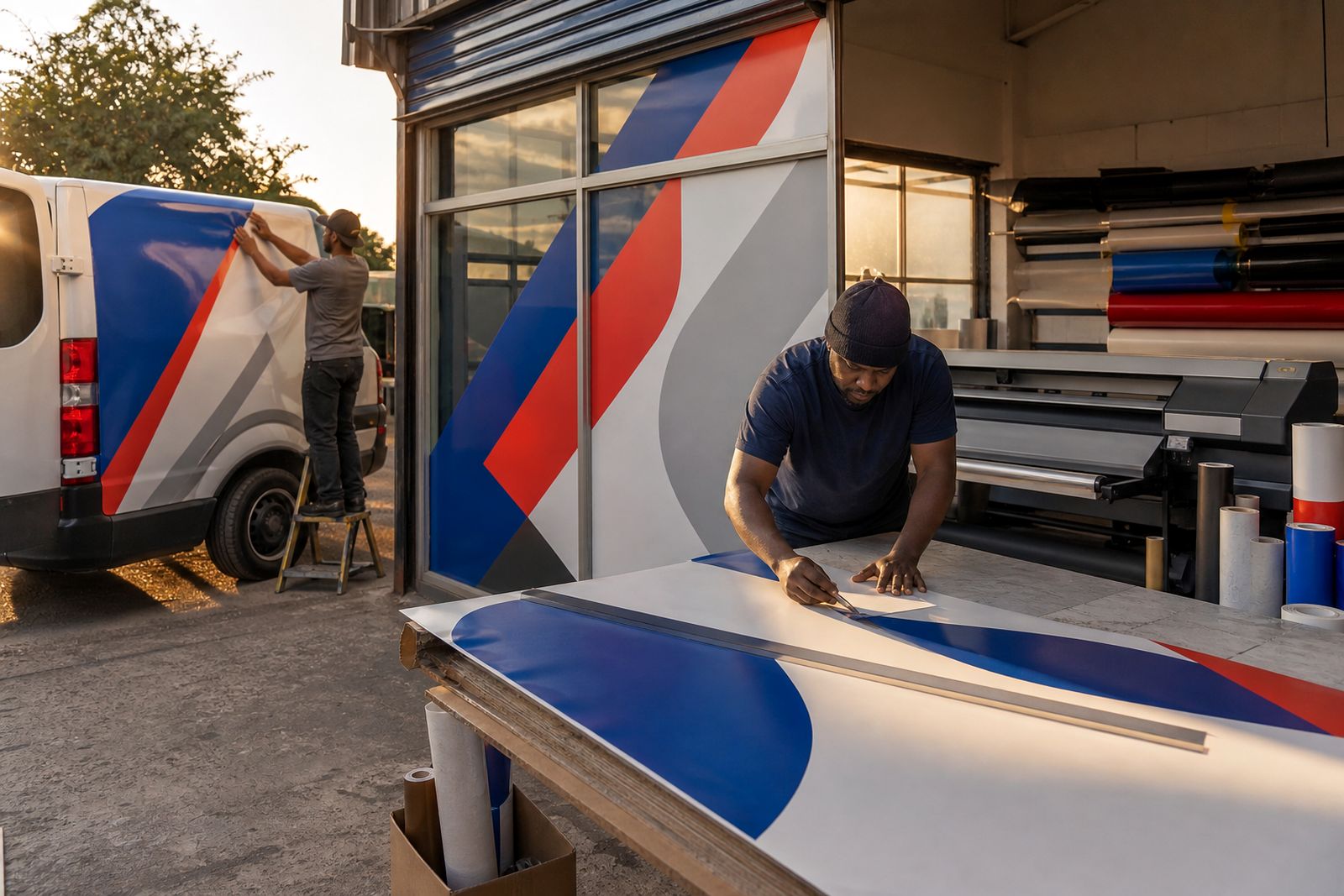
From old sample to artwork
Remakes suit marks that only survive as old prints, worn signs or low-resolution files.
A remake starts with whatever the client can describe from what they still use: the wording and layout on a business card, how the shopfront sign looks, or how the logo appears on workwear or old printed items. Letter shapes, spacing, colours, and symbol proportions are then redrawn so the mark can scale correctly on windows, ACM panels, light boxes, and printed media.
Reference material from your existing branding gives the redraw its accuracy. Existing print pieces, embroidered branding, vehicle decals, packaging, or any other physical item with the logo allow missing strokes, outline thickness, letter joins, and spacing to be identified properly before you move the artwork into production.
Production files that can be used
A proper logo remake produces print-ready brand artwork. A usable, rebuilt brand mark can be sent into cutting, large format print, signage layout, and repeat ordering without guessing what the original design was meant to be.
Enquiries about logo remake requirements can go through the contact form with a short note describing the clearest logo reference you still have and where the new artwork will be applied, such as window vinyl, a tray sign on the client’s fascia, packaging labels, or vehicle decals. Colour expectations can be guided with any existing brand references, such as Pantone or CMYK values, an old CI manual, or printed packaging that already matches the branding in use.
A properly remade logo delivers brand artwork that is:
- Redrawn from poor source material
- Prepared for print and vinyl cutting
From screen to sign
Phone previews make a rough or compressed logo look acceptable, but the same artwork can fall apart once enlarged for a fascia or vehicle side where every curve and edge becomes visible.
Vector paths built for cut‑vinyl redrawing need closed shapes, consistent strokes, and gaps that still weed cleanly at the chosen production size. Printed signs, uniforms and compact labels need solid vector curves, simplified small text, and colour separations that cope with enlargement, reduction, and repeated production without losing clarity.
Remembered details and planned uses
Any remembered details about the existing logo still help, such as the exact wording, colours, layout, or how it appears on older marketing material. Clarity on whether the remake must match the existing branding exactly, or whether uncertain elements may be interpreted from the description, keeps the redraw aligned with the client’s expectations.
The brief names the planned uses for the logo, so the redraw supports how it will actually be applied. A client’s street‑facing window glass with vinyl, a full‑colour sign face, embroidered uniform, and compact price label each call for different line weights, colour handling, and simplified small text.
Also worth a look
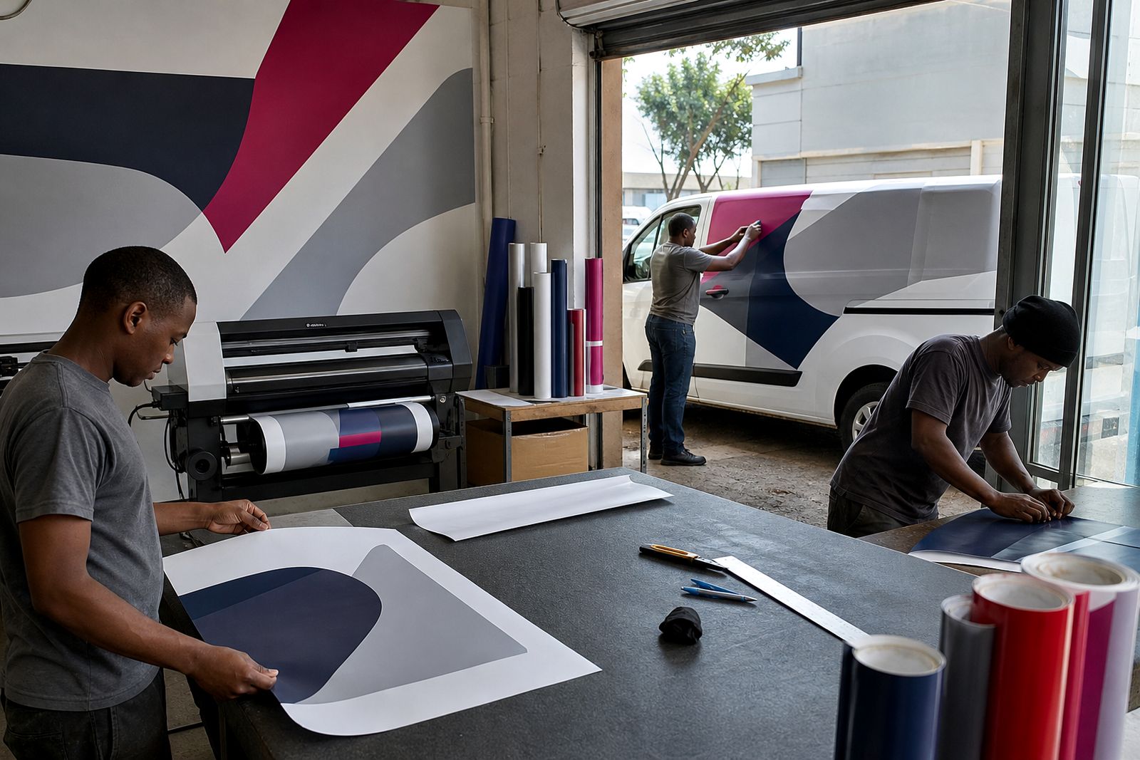
Logo remake specifications
File requirements, redraw steps, and output details for jobs based on a written description, remembered branding or items, or incomplete artwork details.
Read more
Menu board
Menu layouts for your service counters, wall spaces and takeaway fronts, with artwork set up for pricing, item lists and clean, print-ready presentation.
Read more
Night shift
Notes for after-hours fitting by your own crew, with graphics packed in fitting order for sites that open in the morning.
Read moreWhat our Signage and Graphics customers say
Verified Google reviews
Tell us about your shopfront, vehicle or graphics job
Share the site or vehicle, rough sizes and your date, and we will come back with practical options and a quote.
Start an enquiry