Logo remake specifications
Logo remake briefs should set out file checks, redraw needs, and output details so a usable brand mark can be rebuilt.
Rebuild checks before redraw
Remake work based only on rough or incomplete references, such as an ageing print or cropped logo fragment, relies on how precisely those references are described, so the enquiry explains what form the remaining reference takes and whether any original digital file still exists. Where the only usable item is a small printed piece, part of an old letterhead or a fragment of a sign, the brief says so, along with any details known to be missing or unclear.
Logo remakes work from whatever the client can still find or remember, such as wording on an old invoice header, the look of a faded window print on a shopfront, or what was printed on past packaging. Those written descriptions show what can be traced accurately, what has to be rebuilt by eye, and which missing details still require the client to confirm items such as taglines, icon shapes, or small lettering. Retail brands using older signwriting, stamp impressions, or low-resolution social media artwork need a combination of careful interpretation, redrawing, and client confirmation before a dependable master mark is rebuilt.
Strong single references guide a redraw more reliably than a stack of inconsistent reference pieces, even when that lone example is scuffed, faded, or missing pieces. Changes in colour from age, sun, or repeated copying should be mentioned in the brief so the remake is judged against the intended shade rather than a yellowed or washed-out reference.
Files and detail we need
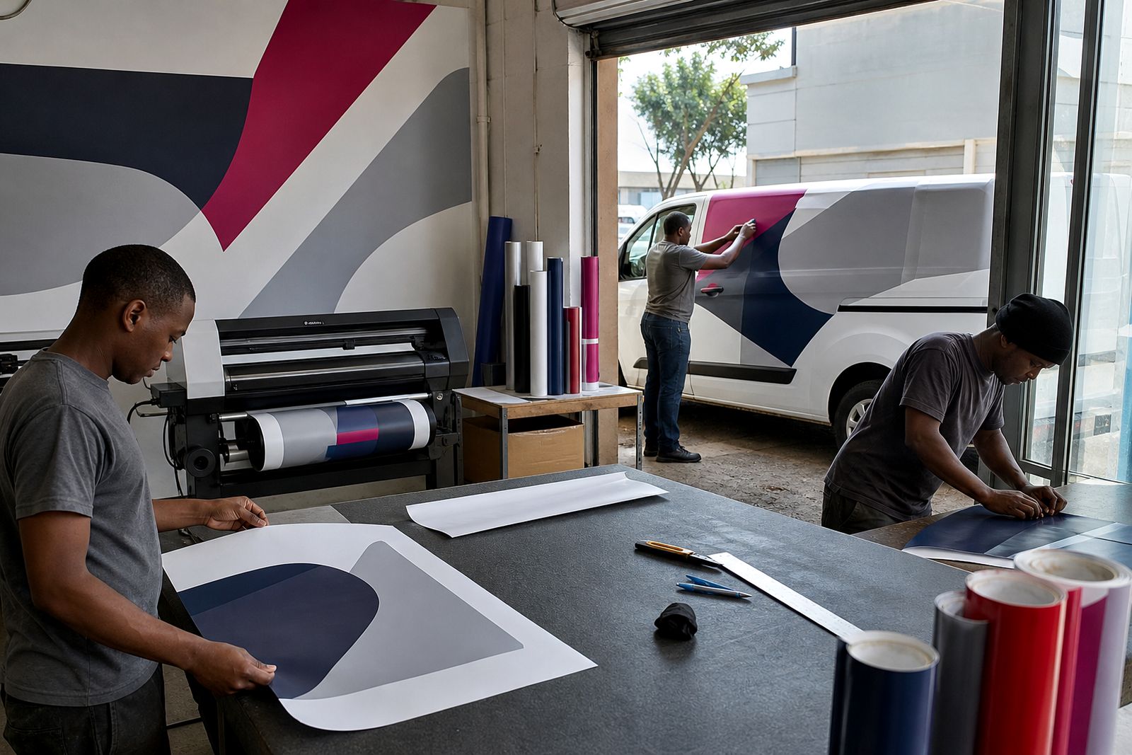
Finished artwork must clearly identify the correct brand wording, symbol layout, and usable output sizes for print and cut vinyl. Vector format for rebuilt marks allows clean scaling for fascia signs, labels, stamp use, and small digital placements without jagged edges. When original artwork is incomplete, the brief lists what was inferred, what was copied directly and what still needs sign-off.
Before a redraw goes ahead, the brief records these checks:
- Reference artwork from print, signage, or packaging checked
- Missing letters and distorted curves noted on the brief
Which version to redraw
Where the earliest and current versions of the mark differ, the brief says whether the redraw follows the first traceable version or the one customers recognise today, and the vector artwork follows that choice.
Colour changes between older printed examples show that the visible shade has drifted from the original brand choice through sun exposure, cleaning products, or low-resolution copying, so extra clues from packaging, uniforms, or stationery guide a more accurate redraw. Notes on how the mark sits on signage also help, and where it runs across corrugated fascias or other textured surfaces, explaining how the substrate bends or breaks the layout lets the true logo shape be separated from surface distortion.
Brief content for a reliable remake
Logo references should note the source, such as a vehicle door, client shopfront fascia, invoice header, or garment print, which parts are definitely correct, and which areas look uncertain. Business name spelling, tagline wording, preferred colours, and any font clue from previous material all belong in the same brief so the rebuilt mark matches how the brand is meant to appear.
What our Signage and Graphics customers say
Verified Google reviews
Also worth a look
Tell us about your shopfront, vehicle or graphics job
Share the site or vehicle, rough sizes and your date, and we will come back with practical options and a quote.
Start an enquiry